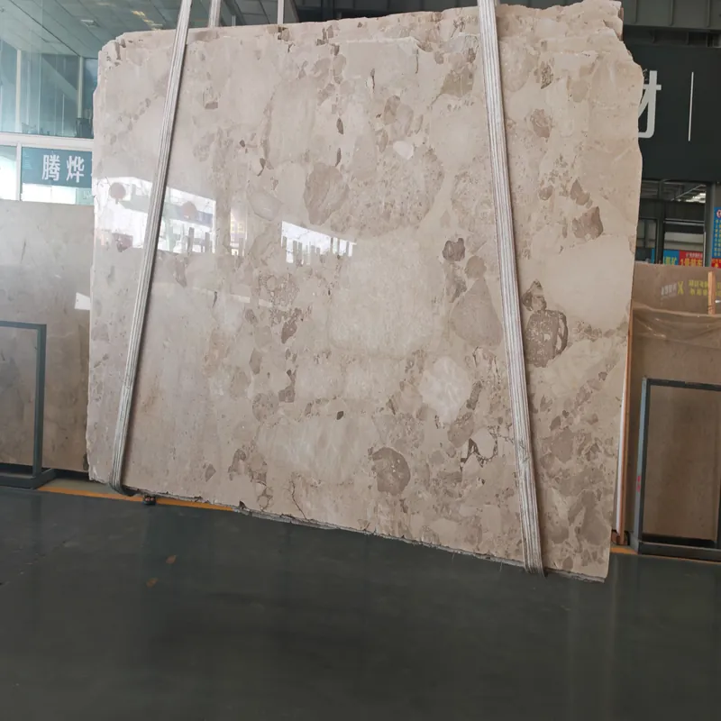
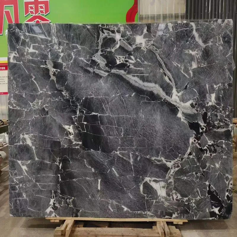
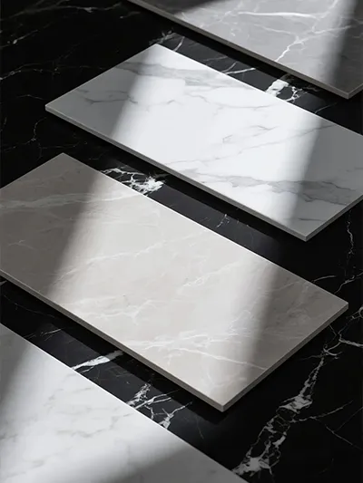
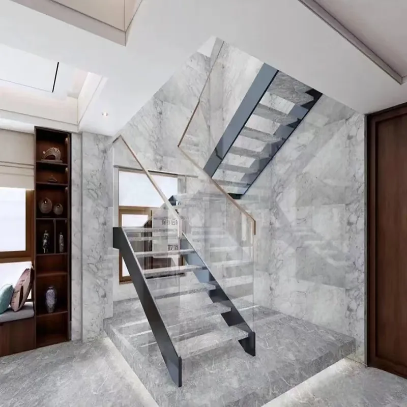
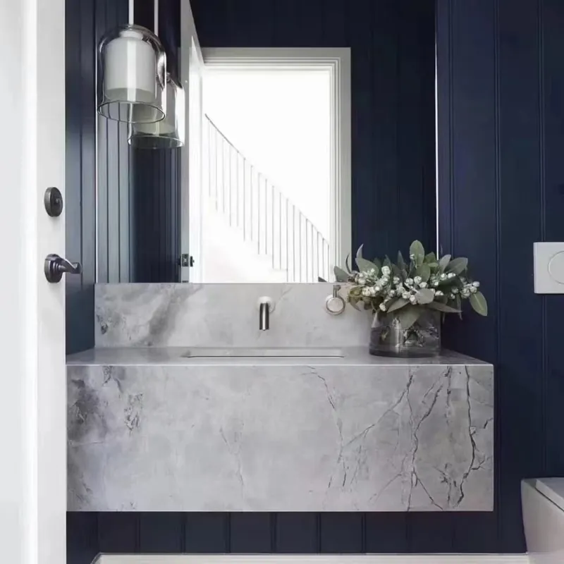
What colour tiles are easiest to match with furniture? Warm greige, soft beige, limestone tones and balanced light grey are usually easier to coordinate than highly saturated colours. Choose the undertone under the room’s real daylight and artificial lighting, then compare it with cabinets, worktops, paint and timber on one sample board.
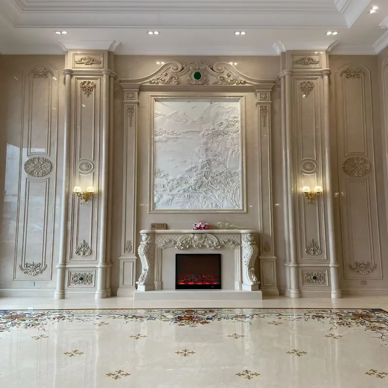
The short answer needs one important qualification: the right choice changes with the room, the product specification and the installation scope. Make the decision from the exact product and room, not a generic label. Check several pieces together, keep the carton and batch information, and put any unverified assumption into the quotation or installation plan before work begins.
| Decision point | What to record |
|---|---|
| Room geometry | Dimensions, doors, focal points and balanced edge cuts |
| Light | Daylight direction, glare and evening colour temperature |
| Fixed finishes | Cabinets, worktops, paint, timber and metal |
| Use and care | Wetness, traffic, texture and realistic cleaning |
Tile works with light, scale, cabinet colour, grout, thresholds and sight lines. A finish that looks impressive alone can feel busy or cold when repeated across a room. Start with the conditions the finished surface will face: water, traffic, cleaning, sunlight, temperature and impact. Then check whether the named tile and the proposed installation system are documented for those conditions.
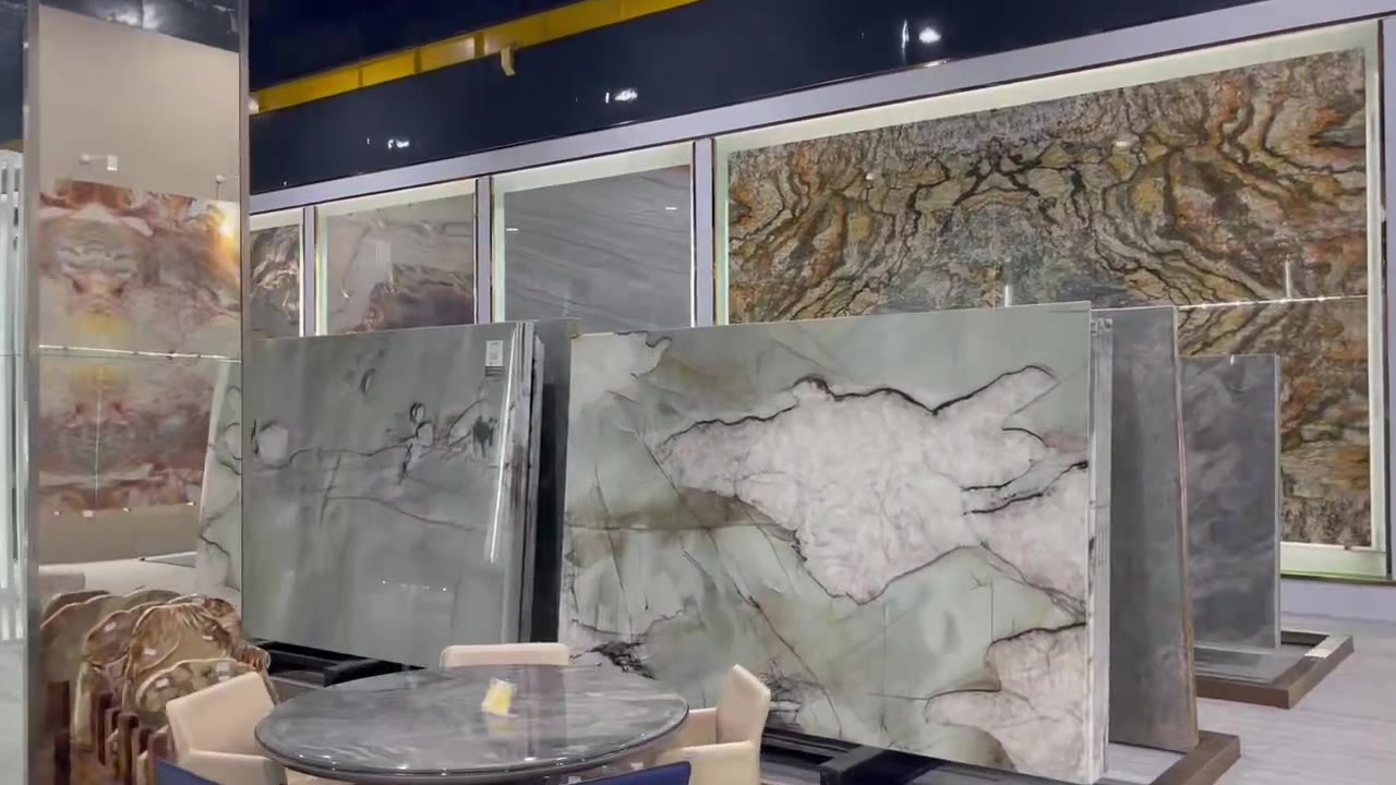
Make the decision from the exact product and room, not a generic label. Check several pieces together, keep the carton and batch information, and put any unverified assumption into the quotation or installation plan before work begins. If the evidence is a test report, confirm that its specimen description matches the size, body and finish being quoted. If the decision is mainly visual, review several pieces together because shade and pattern repeat cannot be judged from a cropped catalogue image.
The commercial side should be equally clear. Record quantity, waste, full-carton rounding, batch or shade control, packing, delivery term, lead time and what happens if replacement pieces are needed. These details keep the answer to “What colour tiles are easiest to match with furniture” useful after the first conversation.
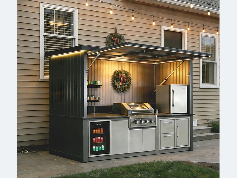
Ask the supplier or installer to state the proposed product and system rather than replying with a general “yes.” At minimum, the approval record should include:
Browse the ForgeWin tile range and use White and Gray Natural Limestone Tile FW-LI-011 as a physical colour and finish reference. For a project-specific response, send the room or drawing, quantity, destination and timing through ForgeWin contact. The measurement and installation pages show the information flow expected before production and site work.
Warm greige, soft beige, limestone tones and balanced light grey are usually easier to coordinate than highly saturated colours. Choose the undertone under the room’s real daylight and artificial lighting, then compare it with cabinets, worktops, paint and timber on one sample board.
Verify the exact model, work size, finish, shade and calibre, intended-use data, quantity and waste, carton details, delivery scope and the compatible installation system. Keep the approved sample and written specification together so a later substitution cannot be mistaken for the selected tile.
Approve it when the sample, layout, performance evidence, quotation and installation assumptions all identify the same product and revision. Any unresolved site measurement, test report, lead time or local-code point should remain an open item rather than being hidden in a general approval.
This article gives general planning guidance. Product suitability, test standards, prices, lead times, installation methods and code requirements must be confirmed for the exact tile, destination and site conditions.
2026-10-14